TORIKI
Full branding for a Yakitori & Craft beer dining place. Sophisticated look targeted at working adults. A place for good yakitori and craft beer.
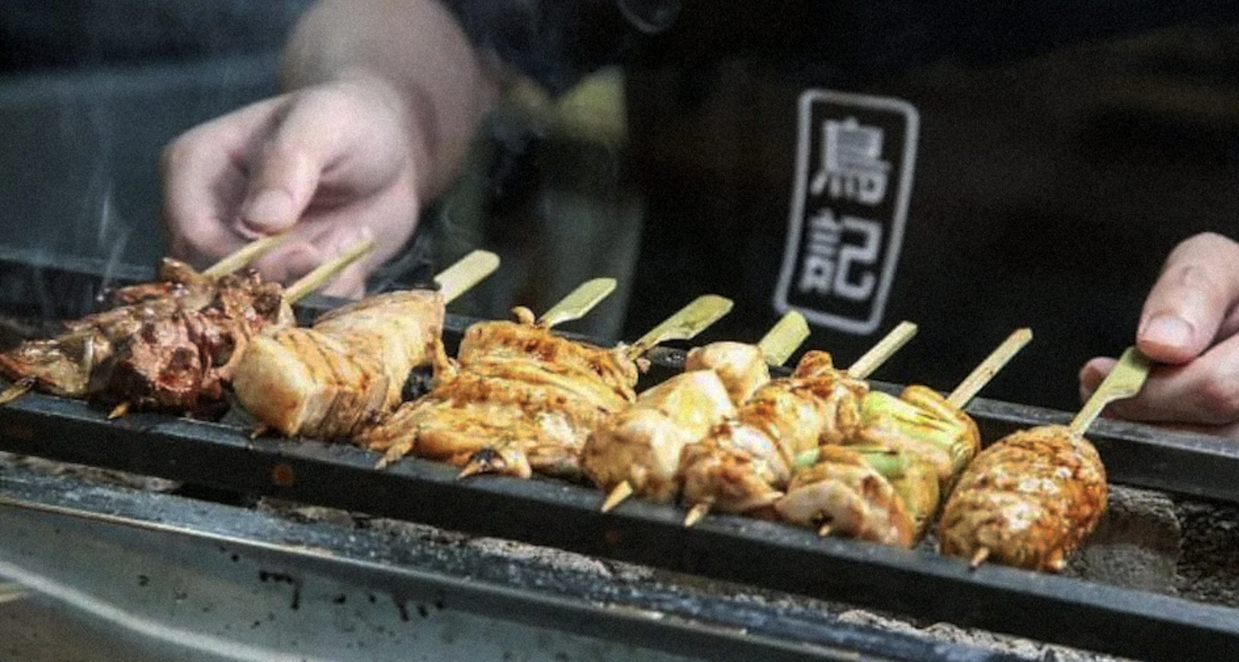
The Story of TORIKI started from two friends who often travelled to japan.
They visit a yakitori store in japan frequently, who serves really good yakitori and beer. Both of them left their office jobs and took a break from work to learn from the restaurants owner and decided to bring the recipe to Singapore.
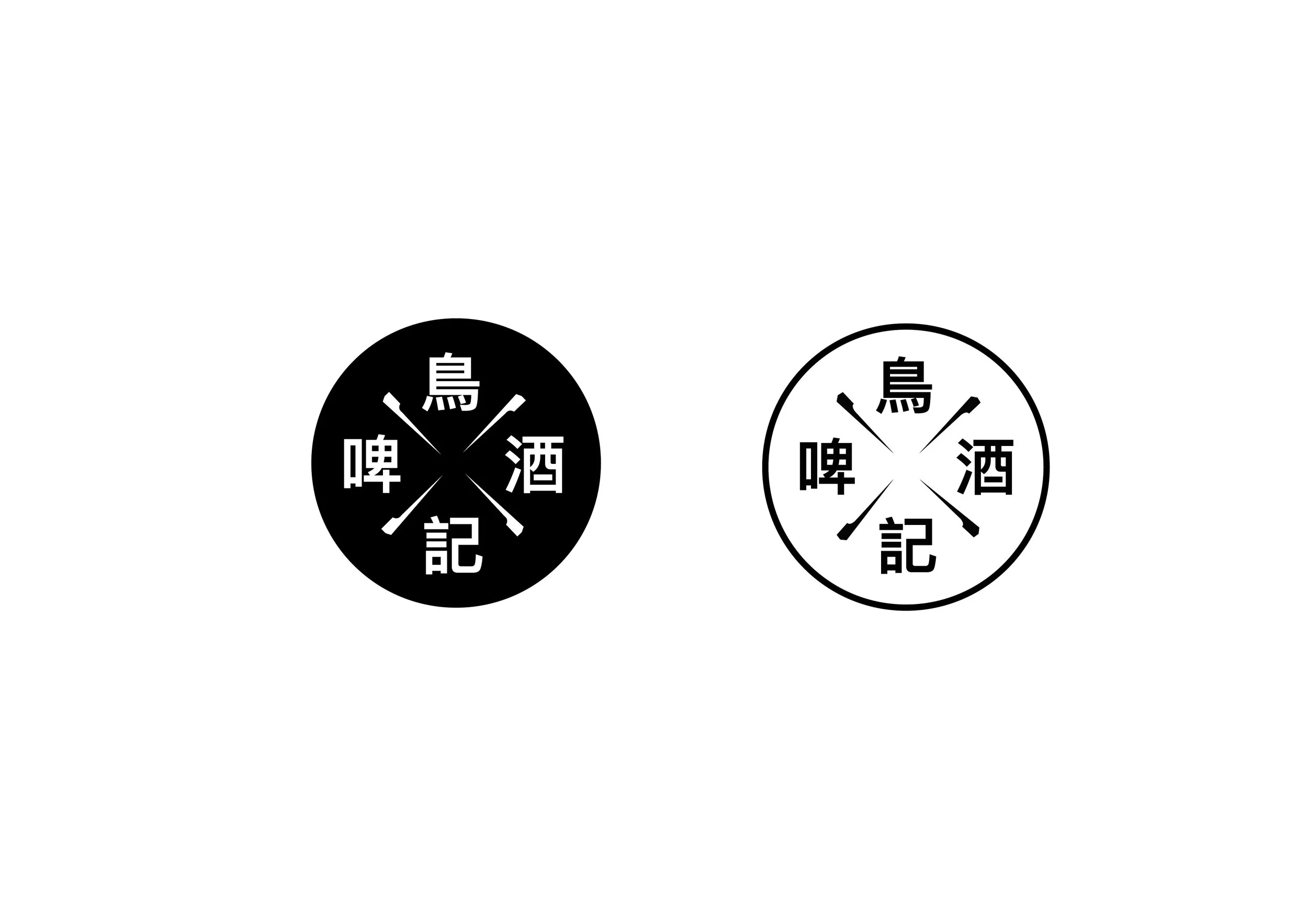
TORIKI - We choose a neat and tight font to bring out the simplicity and subtle boldness in the capital letters. Both English and Chinese logo lean towards using typography to form the brand’s logo. There’s a slight play in the yakitori sticks in the Chinese logo design. San-serif Typography
also matches with our client’s demography and mood.
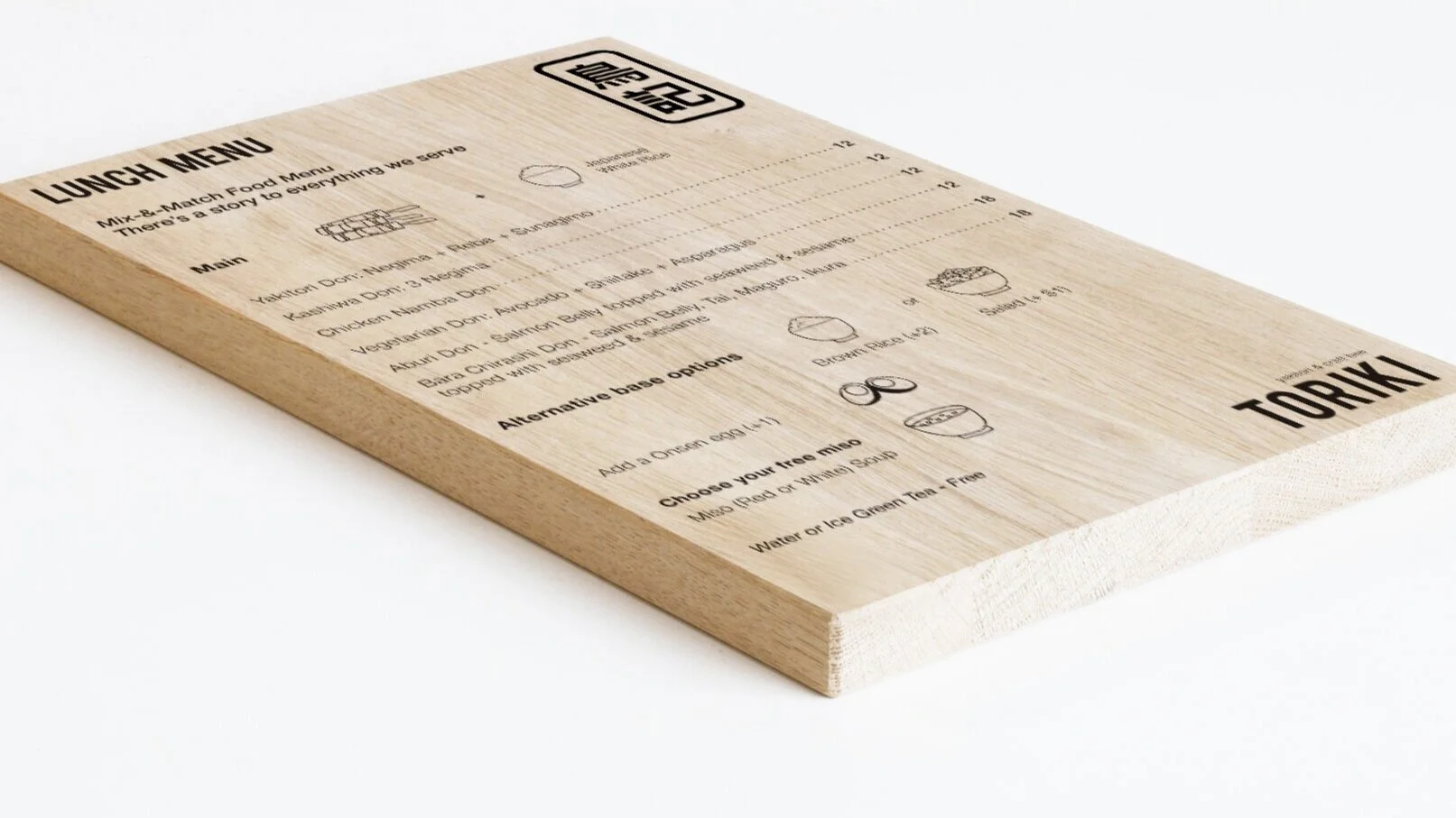
Branding | Creative Direction | Brand development & Assets building