

Gelato Redefined: How Monarchs & Milkweed Rebranded Its Way to Jewel Changi Airport
SCOPE OF WORK
BRANDING STRATEGY, BRAND LITERATURE, BRAND IDENTITY, BRAND SOCIAL MEDIA STRATEGY, PACKAGING DESIGN
AND STORE PLANNING & DESIGN
A Singapore F&B rebranding case study
Most rebrands begin with something broken. This one began with something working beautifully that hadn't yet been given its full expression. When the founders came to us, the gelato was outstanding and their customers said so, loudly and unprompted. The opportunity was to give that quality a brand equal to it, a story, a look and a home that could carry the product to a much larger audience.
The Starting Point: A Beloved Product Ready for a Bigger Stage
Monarchs & Milkweed was founded in 2020 by two chefs, Eric and Mandeep, who met in professional kitchens before opening an intimate shophouse gelateria. Their training showed in the product, small-batch gelato, ingredients sourced and re-sourced in the pursuit of better, a menu that evolved as they experimented.
Around them, Singapore's artisanal gelato scene was flourishing. Birds of Paradise, Creamier and a steady stream of new entrants had built real appetite for craft gelato in the market. The category was growing, and the founders saw the moment to claim their place in it rather than wait.
Their attention, understandably, had gone where it mattered most: the product. Sourcing, churning, serving, running the shop. That focus is exactly why the gelato was as good as it was and it also meant the brand had never been given the same deliberate attention. The story hadn't been written down. The visual language hadn't been built out. Word of mouth had carried the business a remarkable distance, and word of mouth has one natural limit: it only reaches people who already know someone who's been.
The Research: Listening to the People Who Already Loved It
Research across competitor analysis, category trends, and direct customer input surfaced three findings.
A well-defined core audience. Younger working professionals with a clear gender skew, forming a tight and reachable segment with specific tastes, which makes brand-building considerably easier.
Unusually strong existing affection. Customers volunteered praise for product quality, range, and service, often in emotional terms. They were describing a feeling the brand had delivered but never named: a brand identity waiting to be articulated rather than invented.
Accessibility as the primary constraint. The dominant theme was appetite for more, more frequently and more easily. The ceiling wasn't demand, it was reach. Therefore with the new launch at Jewel the brand has solved this issue.
Conclusion: the ingredients of a premium brand were already in the business. What was missing was expression and platform to capture the audiences.
The Strategy: Affordable Premium, and a Tagline to Hold It
Positioning
The recommendation was affordable premium: gourmet craft at an accessible price point.
That distinction carried real weight. The founders' fine-dining backgrounds and their approach to ingredient sourcing weren't marketing spin, they were a genuine and defensible difference. But pricing the brand beyond the reach of its own core audience would simply have traded one growth ceiling for another. Affordable premium let the brand claim the quality without leaving behind the people who had built it by word of mouth.
Expression
Two words carried the positioning: "Gelato Redefined."
The line does double duty. It signals the positioning to anyone meeting the brand cold, and it gives the founders a licence to keep doing what they were always going to do anyway: reinvent flavours, reinvent formats, reinvent what people expect a scoop to taste like.
The Identity: A Butterfly, a Plant, and a Garden
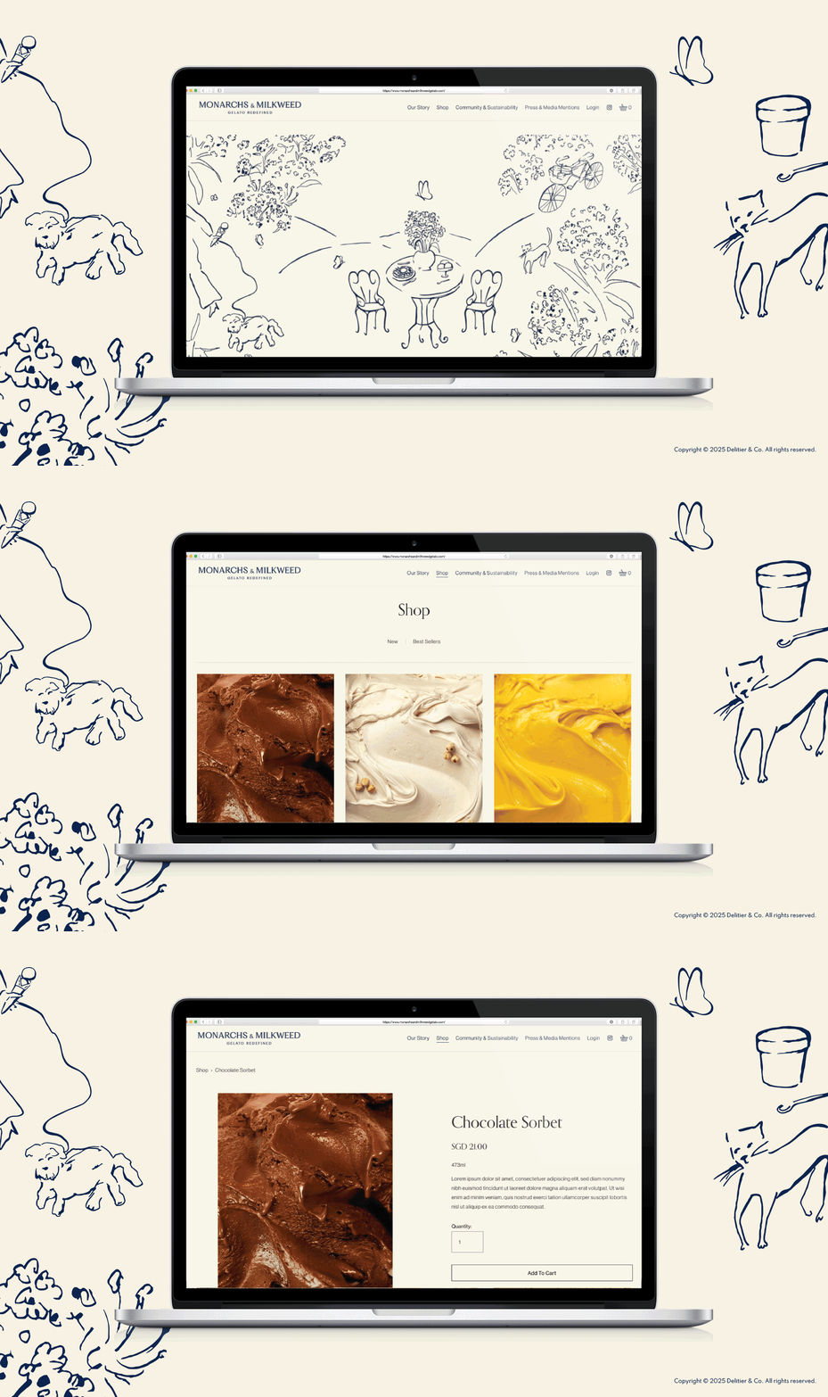
The name had always contained a story waiting to be told. The monarch is the butterfly; the milkweed is the plant it feeds on. Neither thrives without the other. That interdependence: balance, mutual dependence, one thing making another possible, was the brand philosophy sitting in plain sight.
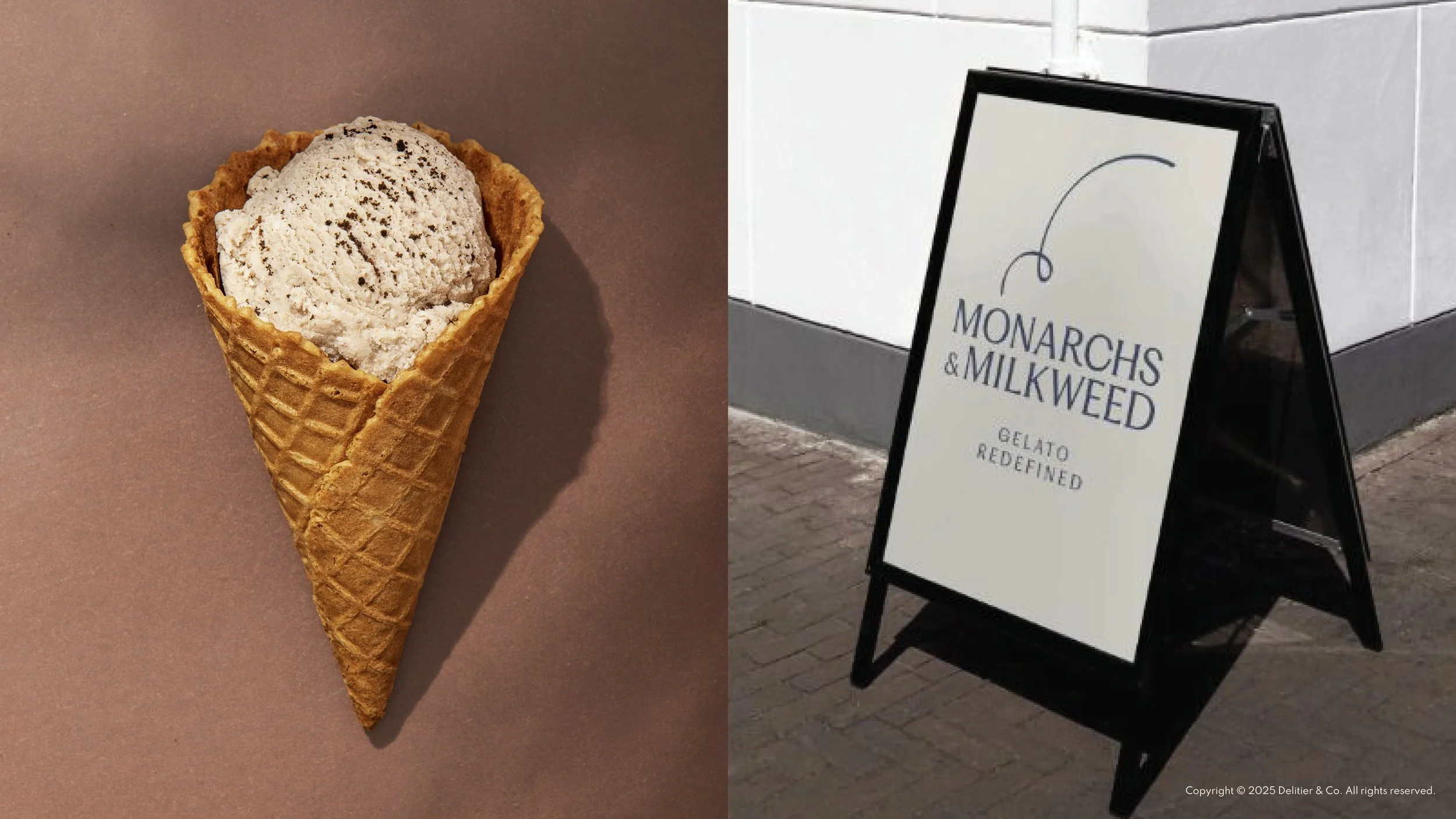
The refreshed logo carries the silhouette of an ice cream in a single artistic stroke. The gesture reads as leaps and bounds: creativity, innovation, and a fine culinary palate constantly reaching for new flavours and new creations.
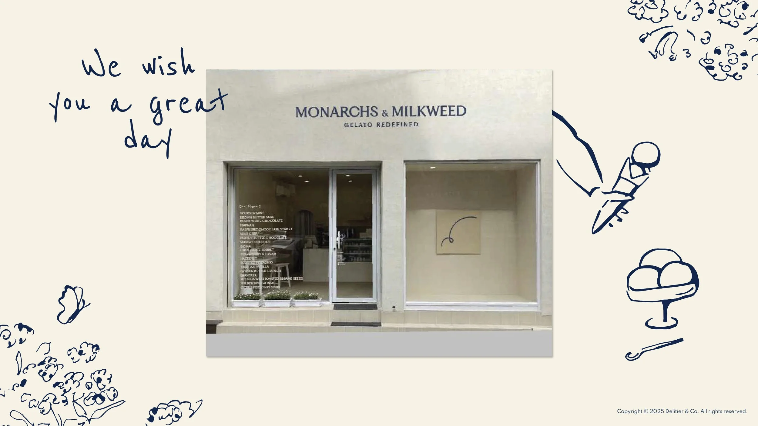
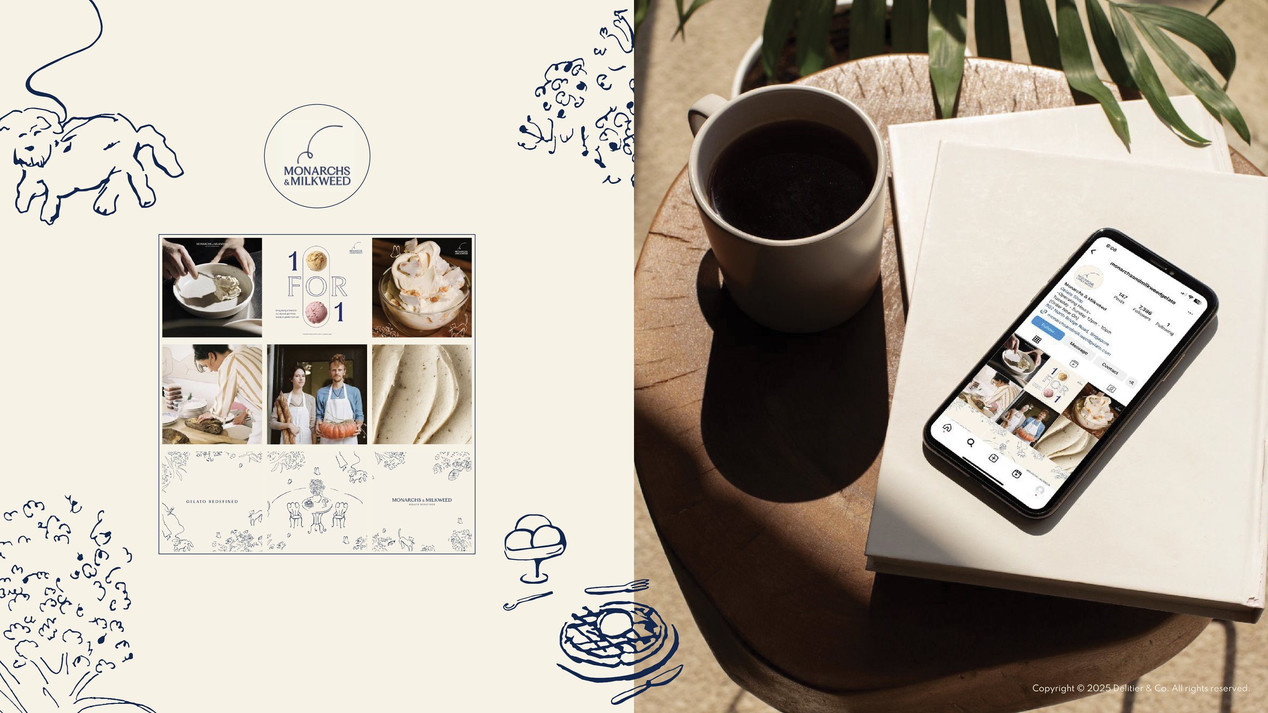
The brand story became illustration. Rather than writing a paragraph nobody would read, we drew it. The butterfly and the milkweed appear together in garden settings, placed in lifestyle and everyday moments, with gelato served in cone and in cup woven into the scenes. It's a love story told visually, and it works because it's true, the name always meant this.
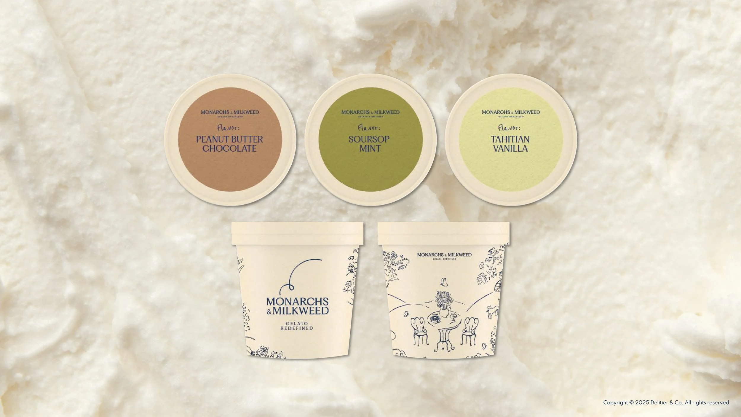
The illustration system runs across every touchpoint. Packaging, storefront, signage, social, collateral. Repetition across surfaces is what builds brand recall, and recall is what turns a loved product into a brand people can name and recommend by name.
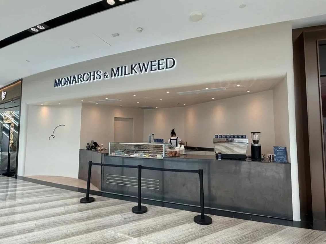
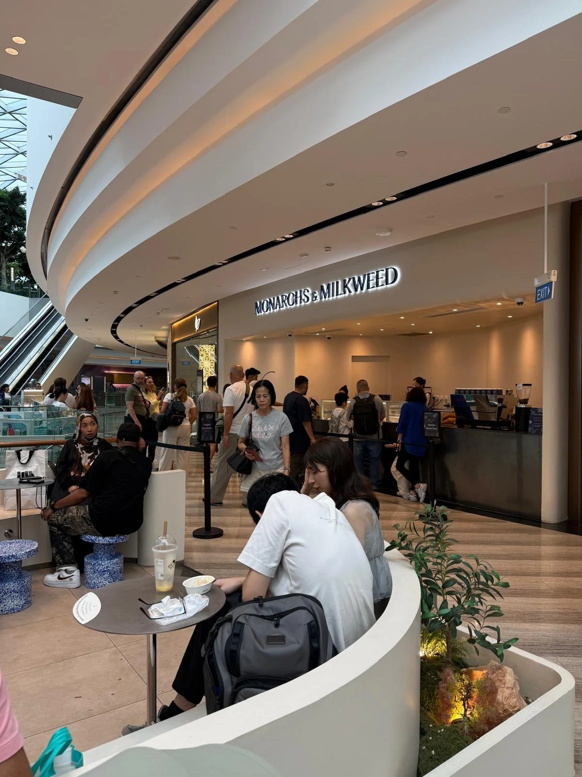
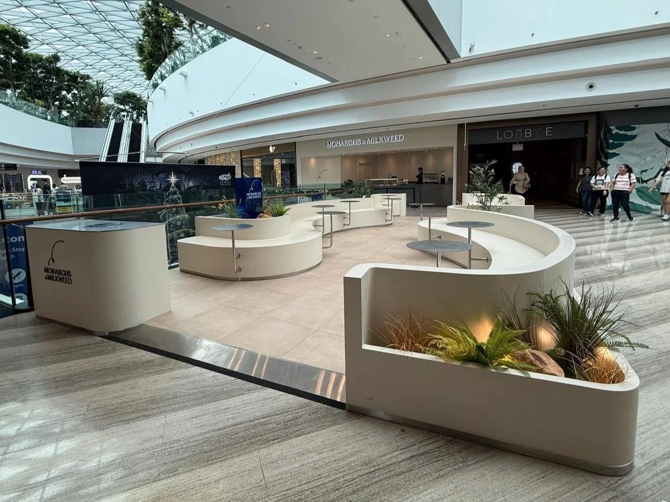
The store makes the illustration real. The storefront and interior were designed so that customers feel they're sitting in a garden, surrounded by plants and flowers, in a minimalist setting that lets the botanicals carry the room. The flavours complete the metaphor: each one becomes symbolic of the brand, inviting customers into the world the illustrations describe rather than just showing it to them.
That's the point of the system. The metaphor isn't decoration applied to the outside of the business, the customer walks into it, sits in it, and eats it.
The Result: A New Flagship at Jewel Changi Airport
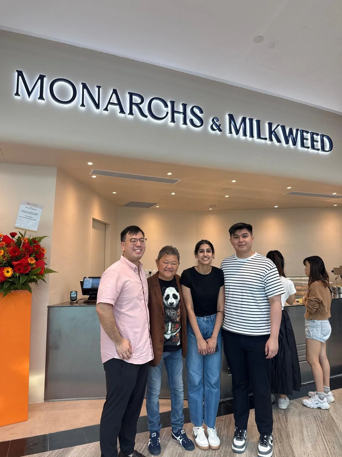
Monarchs & Milkweed relaunched in the new brand look with a flagship store at Jewel Changi Airport, one of Singapore's most visited retail destinations, with an international audience passing the counter every day. The signature flavours have sharpened alongside the positioning: Citrus Pistachio Swirl, Brown Butter Sage, Soursop Mint.
The appetite the research uncovered now has somewhere to go. That's the arc of the entire project in a single move and it's why we treat store planning as part of brand strategy rather than a downstream design job.
Monarchs & Milkweed welcomes their new era.
What This Case Says About F&B Branding in Singapore
A loved product deserves a brand to match. Word of mouth is proof that what you make is working. Giving it a story, a look and a name people can repeat is what lets it travel beyond the people who already know.
Positioning is a choice, not a given. Most brands assume the category they're in is fixed. Choosing the space you want to occupy is often faster and cheaper than competing for the space you're already in.
The best brand stories are already inside the business. We didn't invent the butterfly and the milkweed. It was in the name from day one. A large part of brand strategy is finding the true thing that hasn't yet been said out loud.
Research earns you permission to make bold calls. We didn't propose affordable premium on instinct. Focus groups and competitor studies told us the product could carry it and the market had room for it — which is what made the recommendation something founders could commit to with confidence.
Work With Us
Delitier & Co is a brand consultancy in Singapore working across brand strategy, identity, packaging design and content strategy for F&B, retail and lifestyle brands.